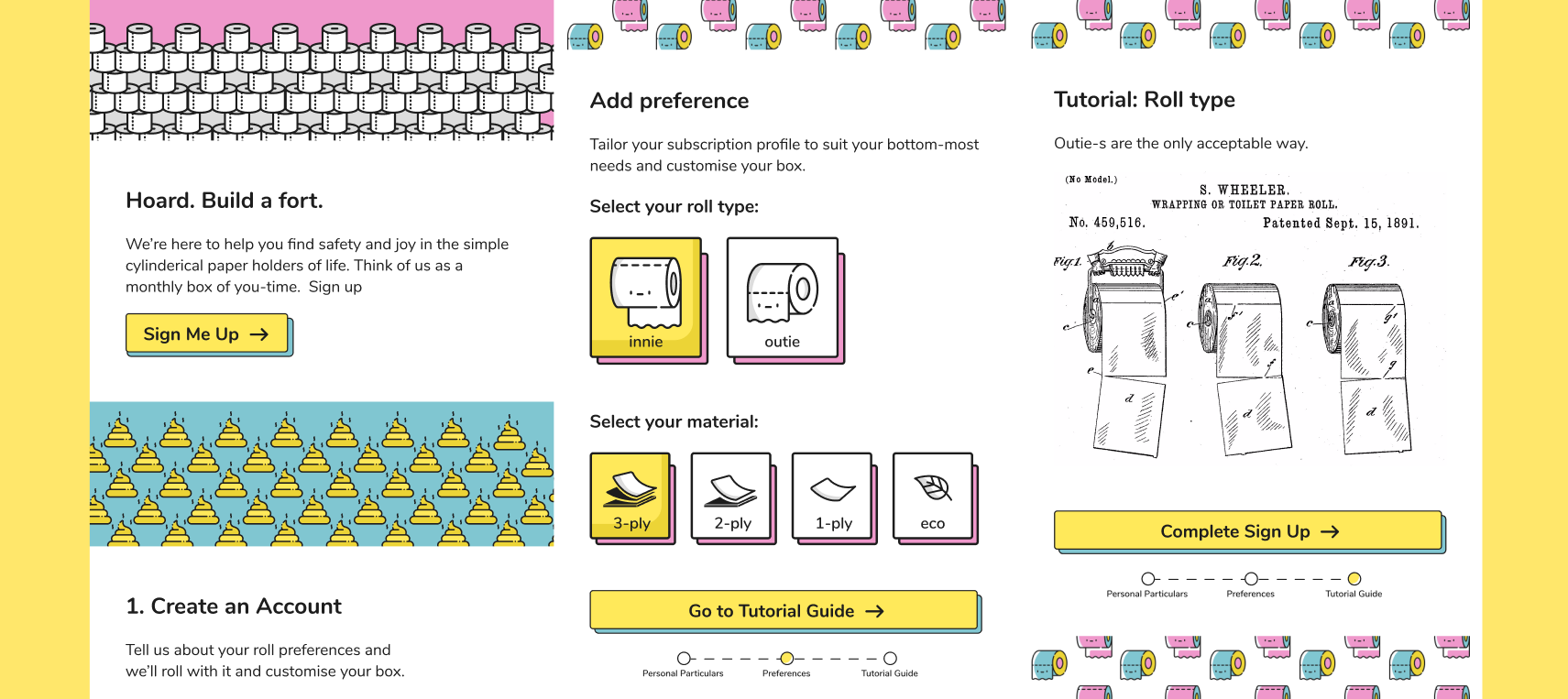
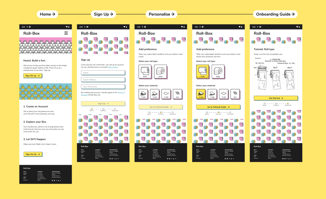
Create A Sign Up Flow
I used a hypothetical company: Roll-Box. Roll-Box is a Greentech-toilet-paper-subscription-box service. Here is the hypothetical CTO’s introduction to the product:
Want to hoard some cylinders in your fallout shelter? Want to build a paper fort? Want to TP somebody’s house? Why not subscribe to Roll-Box today! Simply type in the promo code: FREETP to get your first month free!
A sign up flow has many entry points. On entry, the user goes through a funnel to sign up, personalise his experience and be onboarded. In execution, it looks like this:
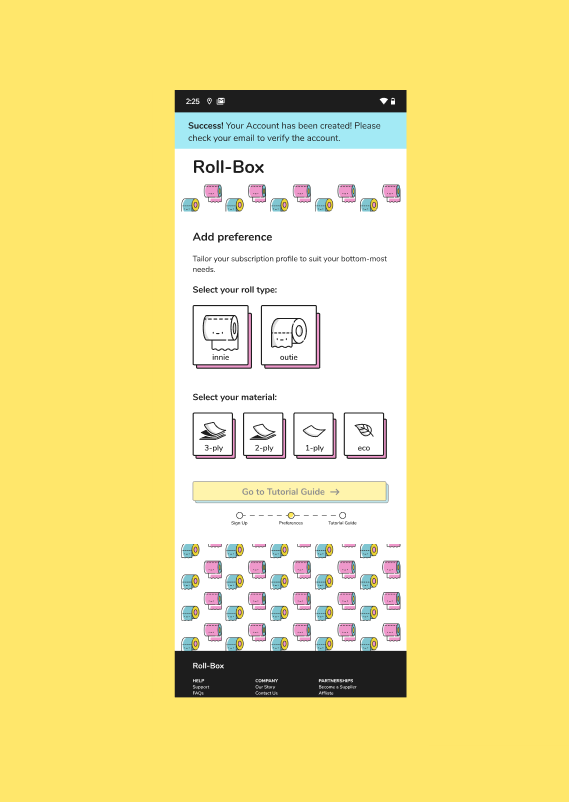
Success States
A successful sign up would trigger a toastbox success alert. The user will be updated about the need to verify his account through an email from Roll-Box.
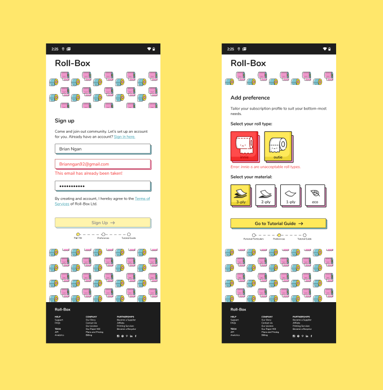
Soft Error States
Error states in the Sign Up flow must be informative and rectifiable by the user. Similarly, when the primary fields are not complete, the primary action must be disabled. These UI will guide the user out of the typical errors in a sign up experience such as:
- Name is wrong (too short, unicode characters, etc.)
- Email address is wrong (not unique, not following the email regex, etc.)
- Password is wrong (too short, too common, etc.)
- Toilet Roll Type is wrong (innie-s are not accepted)
Style
I had a lot of fun with this style. There is an enjoyment in this casual lineal art style and playful colour scheme. I don’t think I learnt anything from a UI perspective. But from a purely aesthetic and layout perspective, I learnt a lot.
- When using flashy and strong colours, ensure that the main colours complement but do not drown out the informational colours. In this case, information colours are used for the primary button colour and error colour. This can be mitigated by ensuring that informational colours are kept sufficiently contrasty or alone in their specific colour space.
- When using lined UI, big lineal icons may appear to be clickable. The workaround is to keep lineal icons small, tiled or clustered.