
Create An App Icon
I used a hypothetical company, Birb Birb, a Food & Beverage industrial cafeteria that primarily sells food of the avian variety.
I don’t think too much about logos. I recognise good logos as ones that are simple in idea, shape and pronunciation. This article does not focus on branding, instead it is about executing the design handover of an app logo.
Specifications
On a hygiene level, the files required from the respective OS types are here: Apple App Store and Google Play Store.
The general rule is that the center image should be 1:1 ratio, outlined, transparent and exportable at multiple sizes. (Else, 512px by 512px .png is fine.)
Learnings
Padding of the center image and the background is important. I keep like a 48px padding for 512px square icons. The reason for such a padding is that android is really flexible with its shapes, ranging from circles, to rounded squares, to squircles to that last funky one.
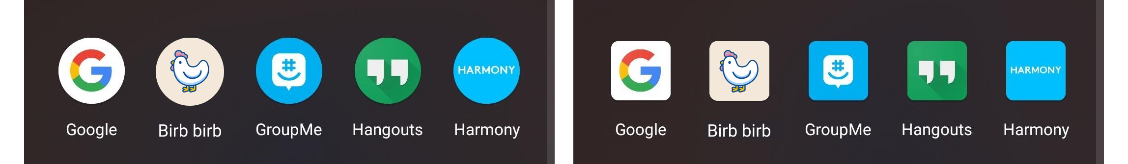
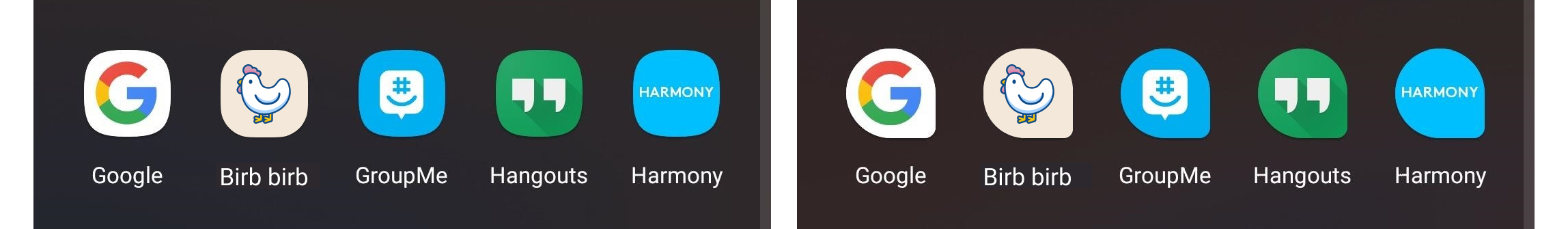
Background colour is also important. It should not bleed into the background. More saturated colours could work well for that.