Create A Checkout Experience
Checkout experiences can involve a surprisingly large number of tasks. Some companies try to do too much, so they trip on their self-imposed complexity. Examples of self-imposed complexity would be to get users to: purchase up-sells, subscribe to post-paid third-party services (like a warranty), apply multi-conditional discounts-on-discounts, etc.
When all the user wants to do is to - buy and receive a potato.
This checkout challenge abstracts away the true complexity of designing this particular module. It is truly complicated because it involves Sales and Marketing. This happens for three reasons: (1) Sales and marketing are revenue generators and naturally have a lot of power in most organisations, (2) Sales and marketing tend to be persuasive and loud by virtue of the role, (3) Most importantly, eCommerce feels like it should fall into the Sales and Marketing purview (it does not), so they may feel compelled to exert authority over it. As such, they tend to throw around persuasive (almost sales-pitch-y), but very complicated or otherwise un-executable ideas. And it is your job to recognise and call out these bad ideas.
And now back to the UI challenge: Design a credit card checkout form or page.
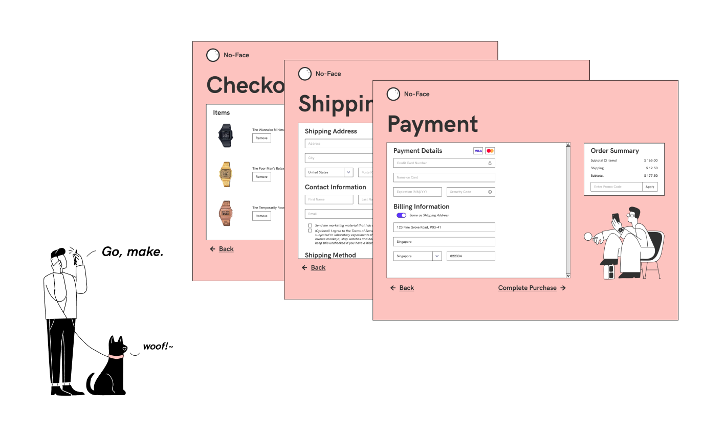
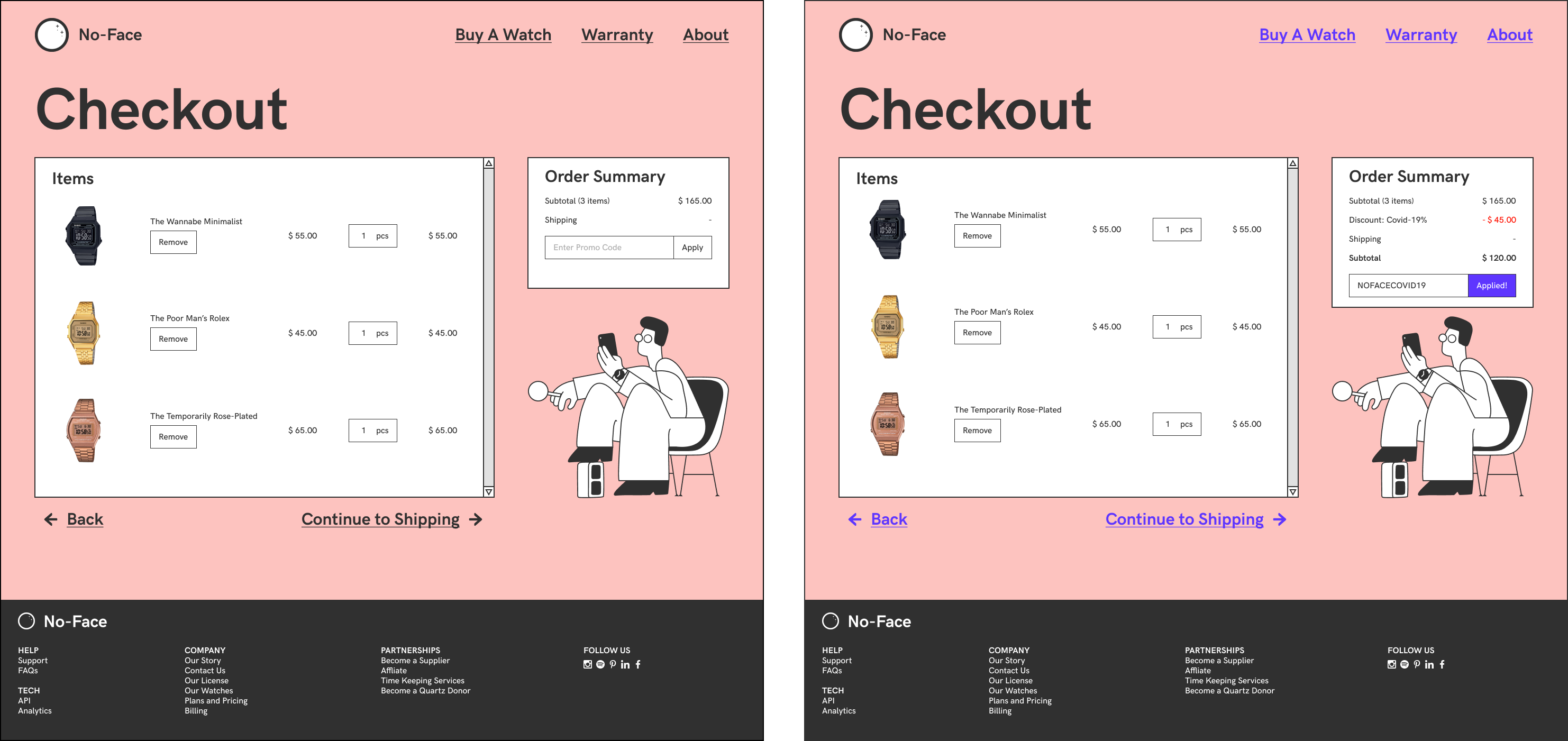
Checkout
The checkout page I decided on is common. I thought it would be neat to have a scrollbar for the main card because it kept my layouts consistent. In hindsight, I would not do that because as the main card grows in content, a lot of content would be hidden beneath a secondary interaction that users may miss. Also, two scrollbars on mobile is generally not a good experience.
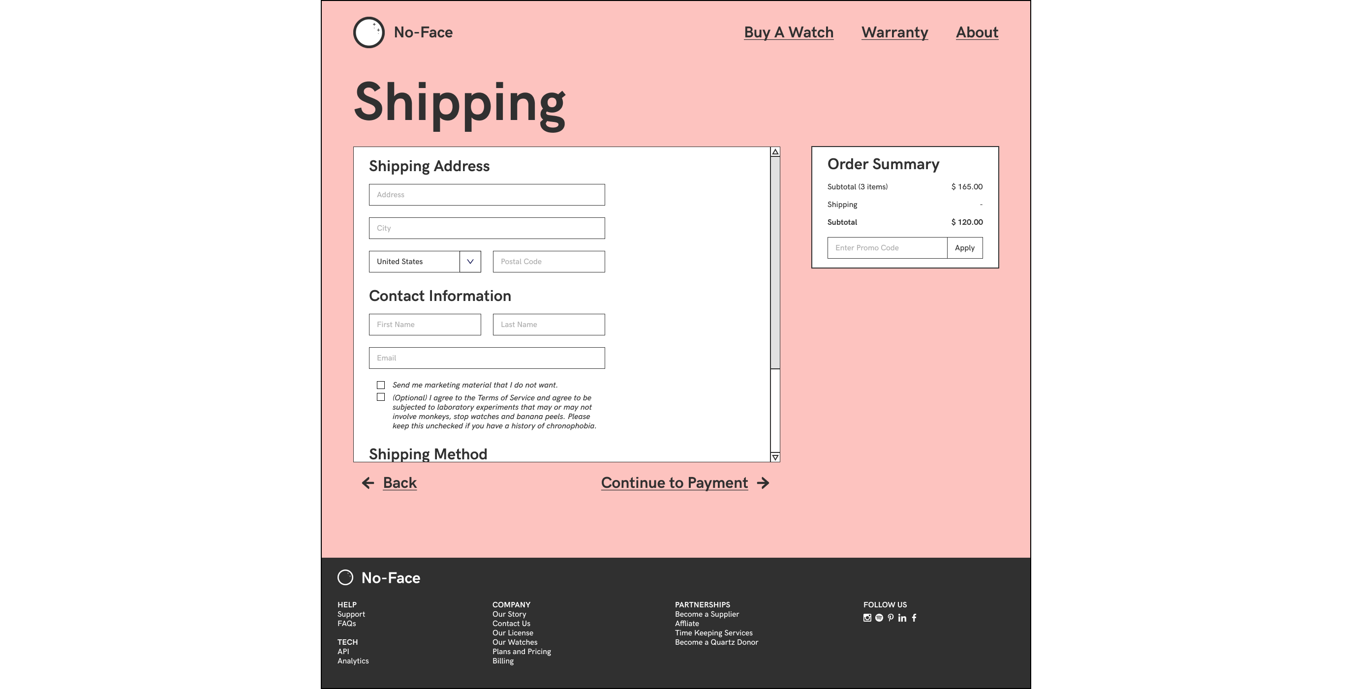
Shipping
The shipping page is also common and formulaic. As it is the internet, you can put anything into the Terms of Service checkbox and users will accept it.
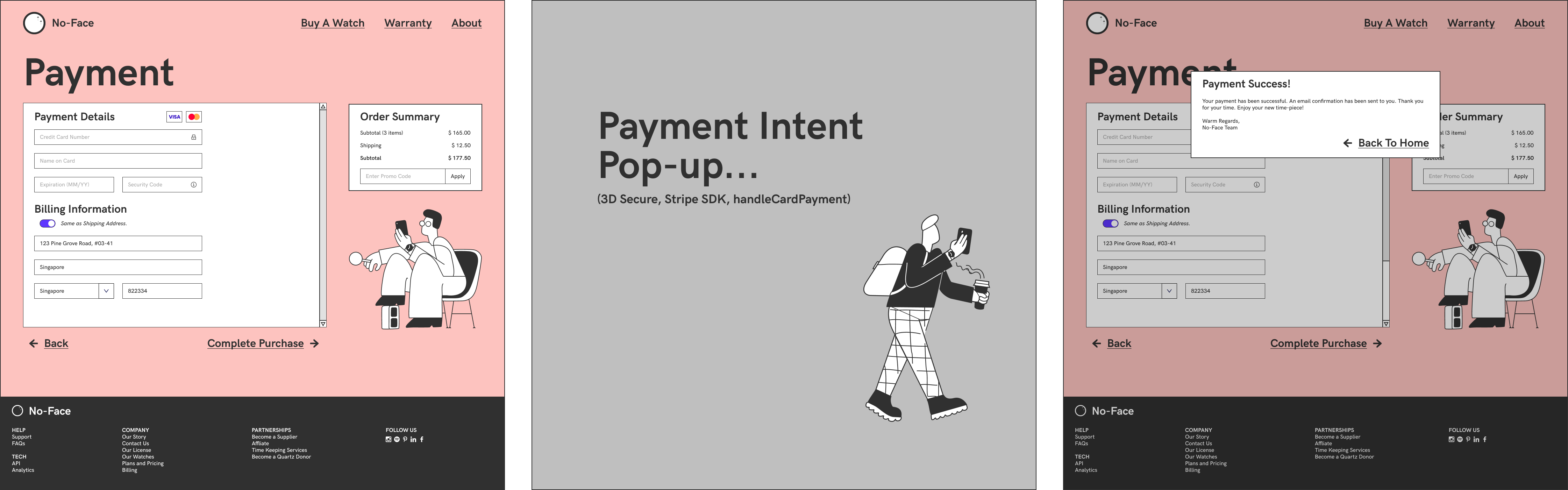
Payment
Payment was an interesting exercise. Revisiting the Stripe Payment Intent user flow was a good refresher since I have not implemented a payment gateway in a while. I prefer the billing address being be same as the shipping address by default; toggle-able by a switch.
Persistent Information
A persistent order summary makes for a good experience. Most check out experiences do this well, but some companies grow the order summary into it’s own long and unwieldy CVS receipt, which defeats the purpose of the summary.
Style
I enjoyed this restrictive colour palette. Matte pink on black has good and readable contrast. Blue, the contra-colour of pink, is great for showing interactivity. I added an underline and blue colours to buttons on hover or on click to confirms the users’ understanding of his action.
The line art goes really well with border-lines of cards; these parts make for a coherent aesthetic.