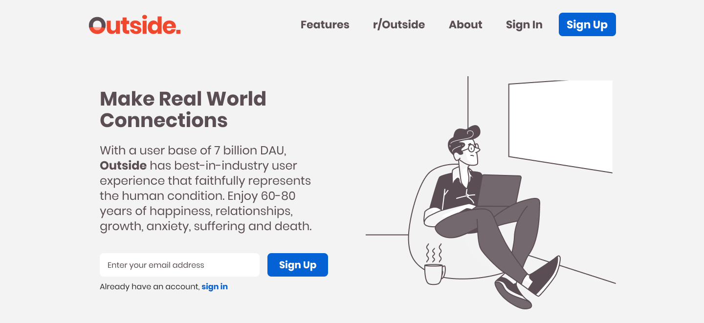
Create A Landing Page
I used the newest hypothetical start-up, Outside. Outside is the biggest social media platform in the world where you sign up by … going outside (Aside: please stay at home if you are on lock down).
For the competitive analysis, I found landingfolio has been a good and relevant design resource for this page. It is a useful as a reference for real world websites.
Below, I go over three sections of a landing page: Action, Value Preview, Social Proof. Based on these three sections, I created the following page:
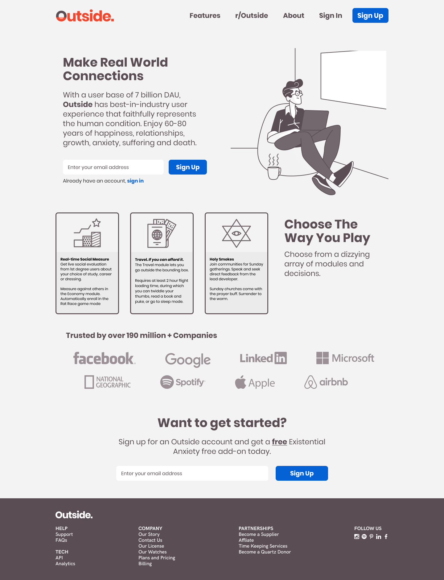
Action
A good landing page has one and only one action (read: CTA Button). It is about the efficiency of guiding a user to core value of the product. At the landing page, this means being very clear of the action needed to lead the user to reach that core value. A good landing page translates to a high clickthru rate and low bounce rate.
The ideal action differs from product to product. It depends what is the core value proposition and the extent that a user needs to try it before making an adoption decision.
For products that target software developer, I like it when the landing page’s action is the code snippet to initialise the module or the Get Started Documentation. An example would be Bulma.io. This would be the quickest way for a developer to get started. For SAAS, I like demos or sandboxes, where the user can go from the landing page to trying out the service in one quick step. An example is code pen.
For most MVPs, given a trade off between efficiency and time to market, the Sign Up With Email is a good enough catch-all solution. The upside is getting their contact to engage in user interviews.
Value Preview
Value preview is presenting the user with just enough information to understand the product. This is particularly contentious to create, because stakeholders will have different opinions on what a preview looks like.
It is always the question of weighing (1) what your user already knows about you, (2) what is the optimal amount of value to articulate.
Being able to encapsulate the product pitch in a concise style: i.e. elevator pitch, cereal box style or a one-page press release. This preview will work well if that product pitch is well-defined.
Social Proof
Social proof is important for B2B products in particular. On one hand, the cost of investment in a B2B product can be very high; making the purchasing manager overly cautious of new products. Next, the defacto purchasing manager is often poorly equipped to understand what your product is good for and can offer. Telling them that a big brand uses the product is a strong and convenient way to persuade from authority.
Style
This style was very minimal and enjoyable to use. My Whites were purely reserved for the window and for the form input field. Both of which I deemed to be the key visual and informational elements of the page. Colours were extremely easy to work with.