1This is part of my ongoing attempt to find simpler pages that solve real problems. 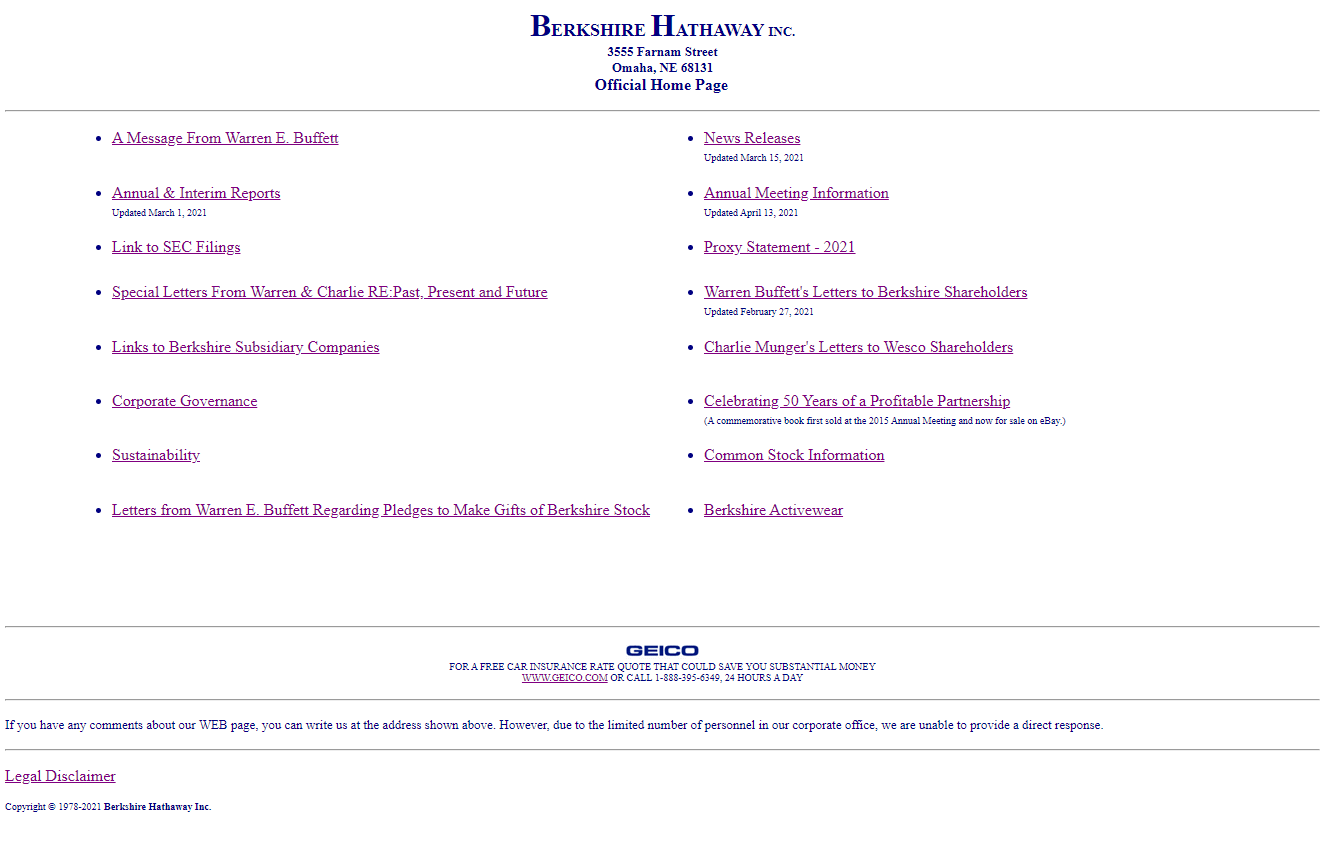
Berkshire Hathaway’s website is charmingly simple. It direct users to investor relation info so that he/she can make an investment decision. And from a UI perspective, it satisfies that goal well. And that makes it a good and simple piece of design.
Nonetheless, it is one quirky page; quirky at least by modern web standards. For one, it is pure HTML; no CSS. Also, it uses obscure elements like <dl>, and <table> (think email templates). I guess these elements still hold up and the page renders in 2021.
In fact, I wonder if this website precedes CSS? If yes, then it has been chugging along for at least the last 25 years; quietly powering investment decisions amounting to $615 bn in market cap. Does that makes it’s code better than 99% of applications or microsites? Most campaign microsites change in three months or less. Most startup, let alone their applications, live and die in spans of less than 5 years. Those dead startup pages and completed marketing campaigns do nothing in the here and now; while this page still renders in 2021. It is definitely punching above it’s weight-class in comparison to many shorter-lived pages - whatever ‘better’ may mean.
I imagine this is how the design brief for the site might have went:
Dev: Hi Mr Buffett. Thanks for taking the time for this discussion. I’ve prepared a number of renditions and have my portfolio here for your reference. I’ve worked for clients ranging from XYZ brand to ABC brand. There’s no website that I cannot build. Please feel free to let me know your thoughts and preferences.
Warren: Very nice work…
(Glances at design sample 1, design sample 2. Glances at portfolio).
Hmm…
(Leans back, looks around his office)
You know… You know what would be really nice. What would be nice is if you could make it look formal. In fact, if you could make it look like this, it would be really nice. (points to 10-K filing on the table).
Dev: (visibly confused face).
Maybe I’m reading too deeply into this because of Bershire’s halo effect. But I can’t help but feel Warren Buffett’s frugality (think $3 macmuffin breakfasts) seeping into the design of the page. It shouts to a prospective investor that we’re a company that is to-the-point, no-nonsense and really tight with our money (all traits of a good investment firm). Maybe that or… It was just 1994 and all websites looked like that.
Check it out at: https://www.berkshirehathaway.com/